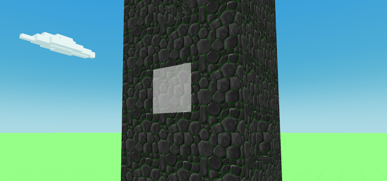
Build mode block highlight update
Build and Crush » Devlog
Untill now, building was a little bit complicated. Especially in the shadowed sides, where you couldn't quite see where the block will be placed. In this update I solved this issue by adding a face highlight to mark where the block will be placed. I hope that this will help you build stuff easier! 
Also removed some small UI bugs.
As always, you can play the game here https://buildncrush.itch.io/game
Files
Game.zip Play in browser
Nov 11, 2019
Build and Crush
Build stuff, crush stuff, and share your creations with other players!
| Status | In development |
| Author | Build and Crush |
| Genre | Simulation |
| Tags | 3D, blocks, Creative, Destruction, Explosions, Multiplayer, Physics, Singleplayer, Unity |
| Languages | English |
More posts
- Added volcano and flamethrower, also other improvements.Dec 01, 2019
- Added airplane and other improvementsNov 29, 2019
- Added MeteoritesNov 25, 2019
- Improved loading speed for images and other stuffNov 24, 2019
- Added FPS mode and othersNov 23, 2019
- Various gameplay improvementsNov 21, 2019
- [VIDEO] Tornado - New Weapon!Nov 14, 2019
- Now you can level up!Nov 11, 2019
- Color blocks updateNov 10, 2019
Leave a comment
Log in with itch.io to leave a comment.